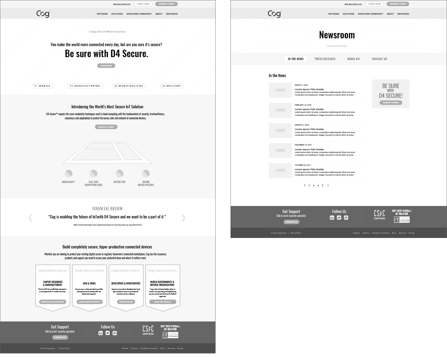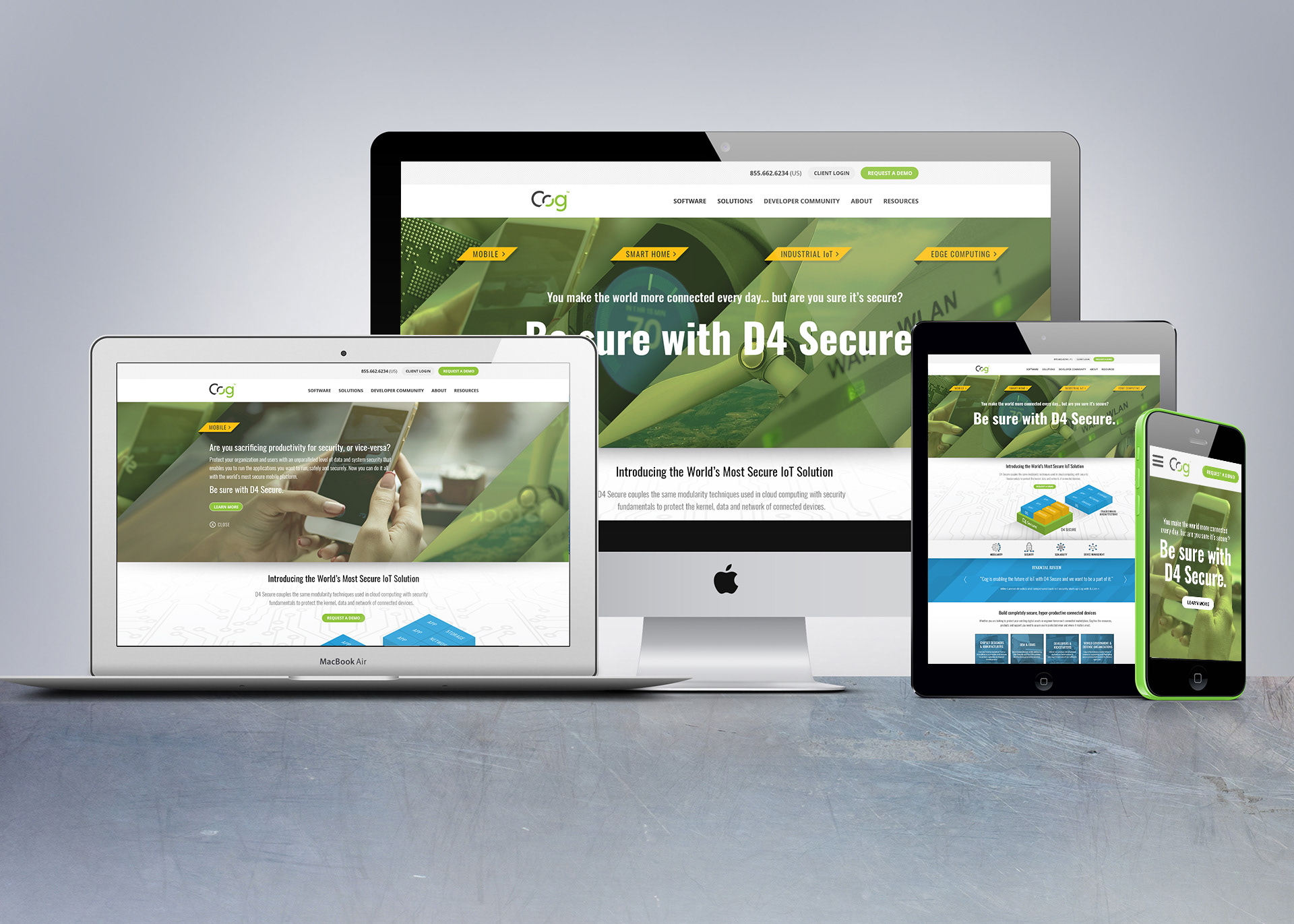
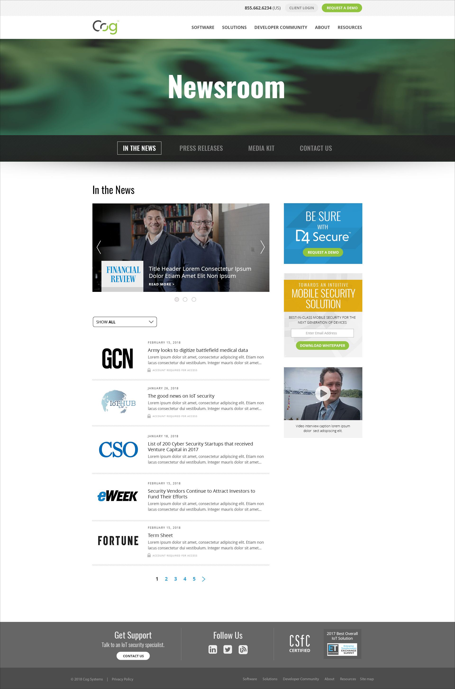
I researched, art directed and produced both the design and messaging for the web site redesign of IoT security provider, Cog (Australia). The final deliverables included new campaign messaging, as well as a new home page design and style guide for the interior pages. and a visual system of textures and icons to enhance the brand and create a stronger identity.

The home page introduced a visual language that took its queue from the diagonal angle in the existing Cog logo. Each section of the hero area expands to reveal a small industry vignette. The brand queue was carried through in the gray and blue backgrounds as well.
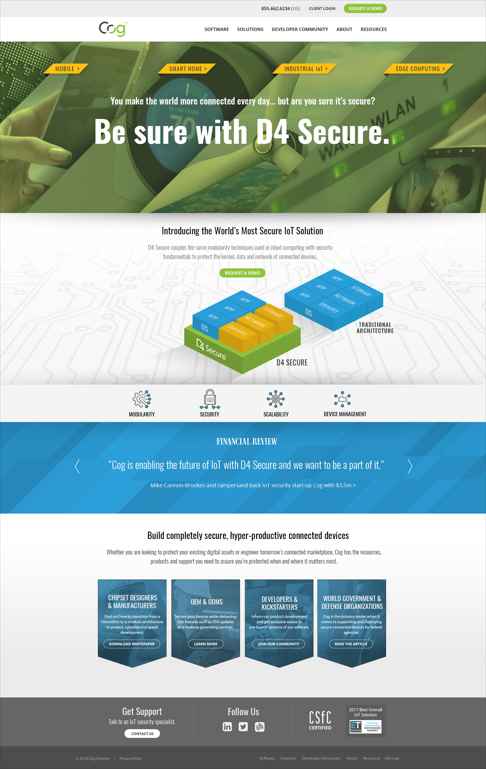


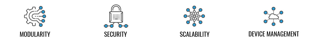
I developed an icon system to be used in tandem with the technical illustrations that are going to be used throughout the web site and various presentations.

Prior to design began, I created wireframes to get client buy-in. This is a standard process when I do web projects. However, depending upon the type of client and the budget, varying levels of fidelity may be required.